My goodness guys, you have no idea how long a journey it has been with my kitchen table.
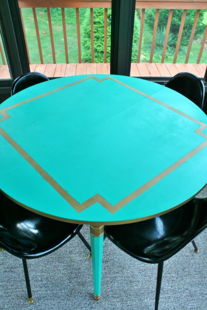
It all began in a sun room, long long ago when I painted a laminate table teal and gold. It was the star of the show in that room, and I loved it with every ounce of my being.

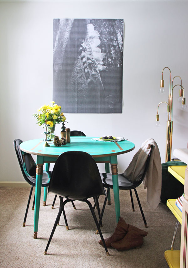
Then I made the move over to the apartment and the table fit perfectly in my little dining nook. However, with my emerald and navy color scheme, it just wasn’t jiving too well. Look at the parade of greens! I still LOVED the color of the table, but it was wrong for the space. Tear.

After living with the many greens for months, I knew it was time to take the table from teal to navy. I know, I know, a huge jump for me.
The hunt for the perfect navy paint began. Don’t worry though, I was all sorts of confident. I scoured Pinterest looking at navy paints. I decided I want to use a Benjamin Moore paint because of the rave reviews I had heard about it being used to paint furniture. Thankfully, I also discovered that they had the ultimate navy blue paint color: Hale Navy. I looked at picture after picture of it. It seemed to be the exact navy I wanted.
I happily jaunted down the road to Benjamin Moore and got a quart of their Advanced line recommended for furniture painting.
I went home, sanded her down, and put on a coat of primer. I decided to leave the gold accents so I carefully taped around them (except on the top where I wanted them gone). Then I went in with my perfectly picked color.

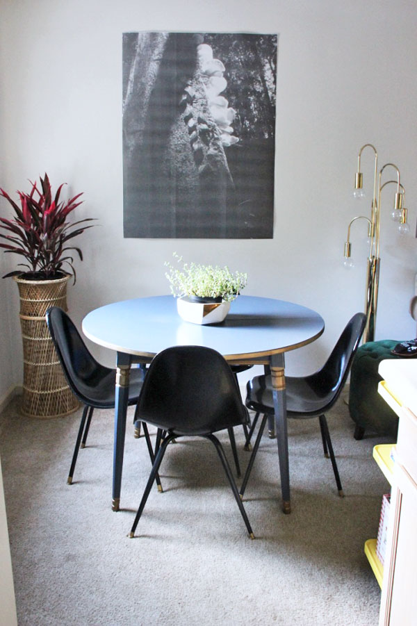
Except it was all wrong. My perfect navy was reading periwinkle in my space. PERIWINKLE? No thank you! That’s not the look I was going for! I thought perhaps it just needed to darken up so I put coat after coat on the table.

This did nothing for the color; it just made me tired of painting and exasperated.
I finally peeled off the tape to reveal the gold accents – which I definitely didn’t love with the periwinkle shade.
I was exhausted at this point so I just let the table sit for a week or two. The color definitely didn’t grow on me.
I thought I would try again, scouring Pinterest to see real life pictures and then this time I was going to get a sample! I picked another Benjamin Moore color and got a sample. Seven dollars later and a swipe of paint on the table, I once again knew this wasn’t the color (so much so I didn’t even take a picture or remember the name of the blue).
That’s when progress came to a screeching halt for about two months. Whatever, the table was painted, and I was tired of repainting it.
I finally felt energetic enough to start the process again when I saw this gorgeous Venetian Blue Opaque (metallic line) at Haven Conference in the Modern Masters booth. Plus, they were happy to send me a sample with the top coating needed for the table. YES! I was able to see a sample in person and knew this was the color. Plus, metallic paint is so my jam.

So a week or so later the paint arrived at my door and my painting spirit was reignited! I decided to let go of the gold accents because that would be too much with the metallic paint. After a quick sand and one coat of primer, I did two coats all over of the Modern Masters paint, with a quick third coat just on the top. I followed that up with two clear coats.


Hallelujah! I LOVE THE COLOR. I definitely breathed a sigh of relief when I stood back and looked at it in its final coat. It’s the deep blue I was imagining and look at that baby shine.

Phew, I am relieved that project is over….you know, until I feel like changing it up and painting it again. I don’t see that happening anytime soon.
This is definitely one of those projects that you learn along the way and try to embrace the trial and error.

Lesson Learned: You never know how paint will look in your specific space so get samples! It can look so different one room to the next based on the lighting and other colors surrounding it.

No, not every DIY project is a winner the first time, but never, never, never give up! Keep going and you will find your perfect shade of metallic blue (or whatever your perfect shade is).
Now excuse me as I am going to sit down and enjoy a meal at my beautiful metallic table. 🙂 You know, since I’ve been eating on the couch, floor, or standing up in the kitchen as I’ve waited for paint to dry on my table for far too long.


Perfection! I’ll bet that this metallic is even more sparkly and gorgeous in person. I liked the table’s first look that you did for your porch and now it’s perfect for your apartment. I think I need to check out some of Modern Master’s colors.
It is so much better in person! It’s hard to capture the shine in pictures. I am so happy with it!
Hi Megan,
The transformation of your table is cool. I like this vibrant hue and it looks much better than the ‘navy’ color you’ve tried before.
Thank you!! I totally agree!